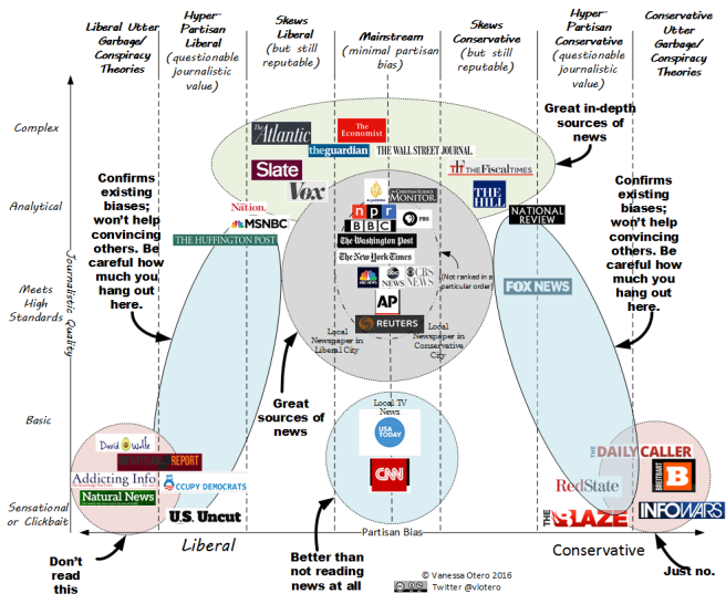
Like a lot of the Internet, I’m pretty much in love with the News Quality Chart created by Colorado attorney Vanessa Otero, which is now available on her blog, All Generalizations Are False. The chart does a really effective job of rendering visually both political bias (horizontal axis) and intellectual/journalistic rigor (vertical axis), yielding a really valuable tool for figuring out what popular press sources are useful in different contexts. Sometimes a basic news bite about a particular event is all you need, but most of the time, you’re looking for a source that at the very least “Meets High Standards” as she puts it. Sometimes a certain amount of political bias is okay, but a lot of the time, you want to find the most unbiased material you possibly can (understanding, of course, that this is the real world and I’m not sure it’s possible to find a human being completely devoid of bias).
Anyway, I’ve found the chart useful in explaining to students how to evaluate popular press news source, so hopefully you’ll find it handy as well. Here it is: